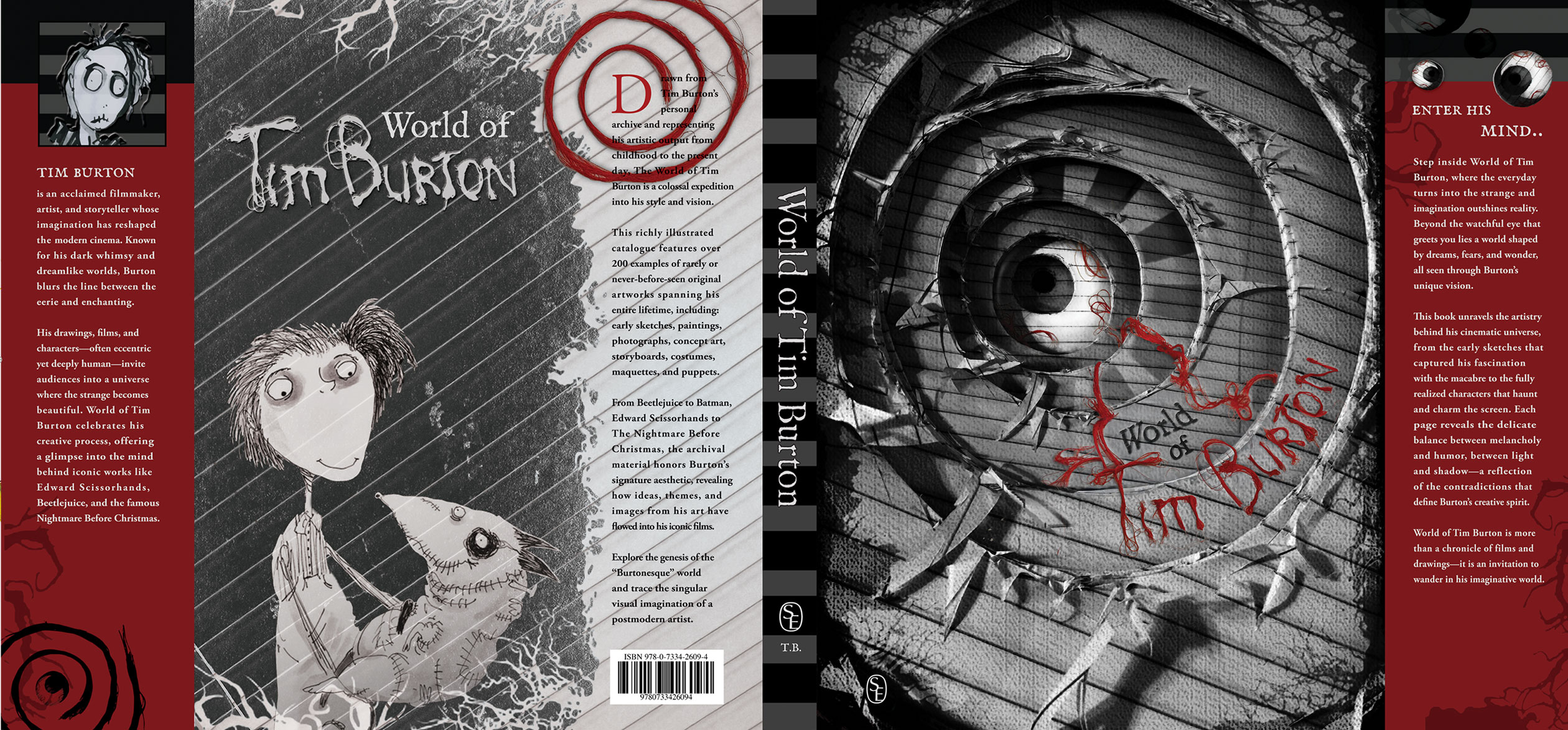
This assignment encourages students to explore typography in a more hands-on and experimental way. Instead of relying only on digital tools, they work with physical materials and techniques to create type that feels tactile and expressive. Letters are treated as flexible elements that can be shaped and manipulated to communicate ideas in more personal and unconventional ways.
As students research and reflect, they begin to translate the essence of a book into visual form, searching for ways to communicate meaning without relying on convention. The cover becomes a space for interpretation&mdah;where composition, contrast, and material choices work together to evoke a narrative. By stepping outside familiar tools, they open the door to new kinds of thinking, where design becomes both exploration and discovery.
Distortion, in this context, is not a flaw but a language. Characters may bend, shift, and transform through hand-driven processes, carrying the marks of their making. Yet, this expressive freedom is grounded by structure: the final composition is carefully assembled, with attention to balance, negative space, and clarity. Wrapped around a real book, the finished piece exists not only as an idea, but as an object—something held, experienced, and brought into the world.
Students explored a range of hands-on techniques to bring their typographic ideas to life. Some worked with unexpected materials, such as cutting letterforms from galvanized steel, giving their designs a strong, industrial presence. Others took a more delicate approach, layering organic elements to create softer, more atmospheric compositions.
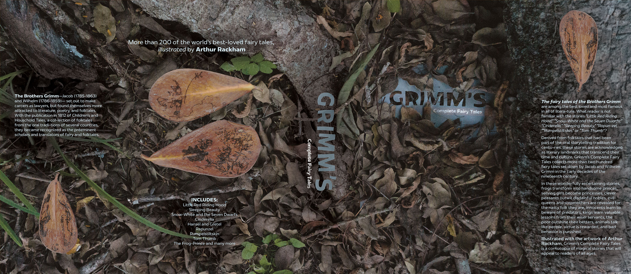
In the project shown above, leaves were carefully arranged and combined with cut-out letters on vellum, resulting in a Grimm’s fairy tales cover that feels both mystical and poetic. Through these processes, students discovered how material, texture, and composition can shape meaning, turning typography into a rich, sensory experience.
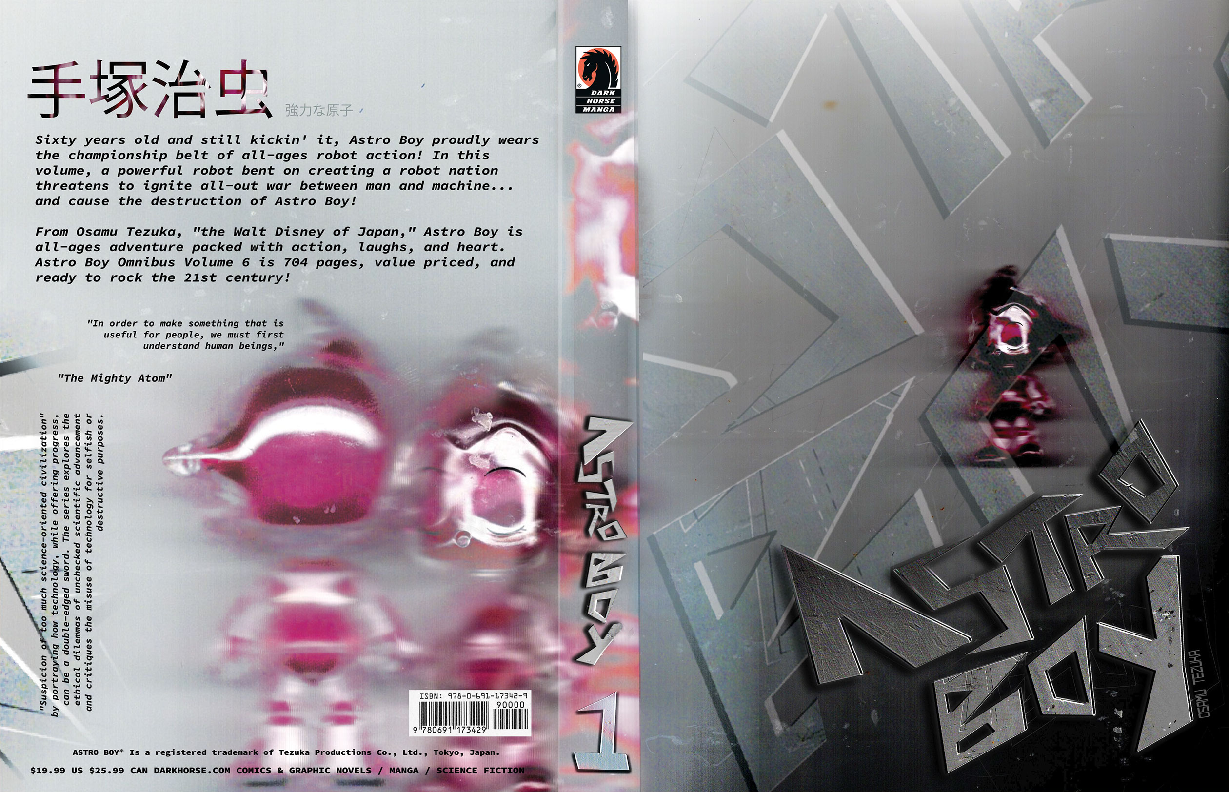
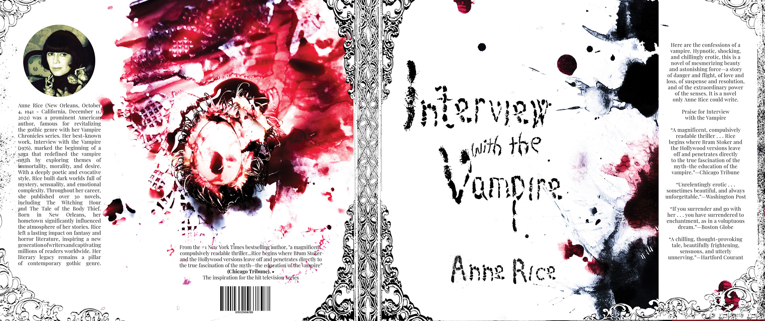
Some students experimented with unexpected yet highly fitting materials to shape their typographic concepts. In this striking example below, rambutan fruit was used to evoke a sense of mystery and blood, creating a visceral, tactile quality for an Interview with the Vampire cover. This approach brought an otherworldly intensity and freshness to the letterforms, showing how unconventional materials can transform typography into a powerful visual experience.
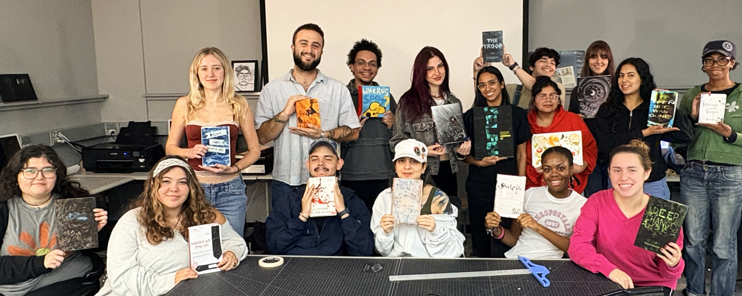
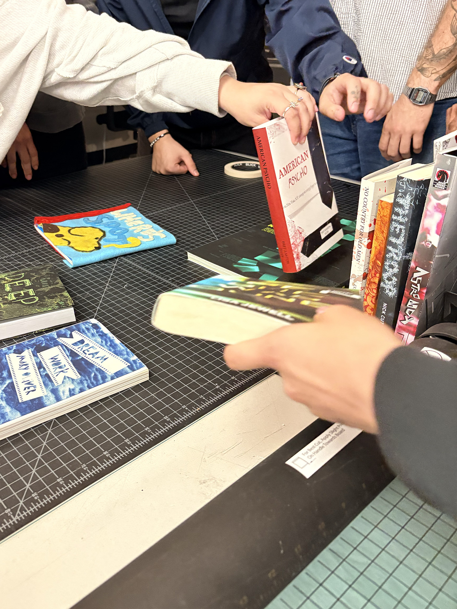
Students embraced this project with enthusiasm, approaching each piece with curiosity and a willingness to experiment. The process was playful and exploratory, allowing them to push ideas further and discover unexpected visual outcomes.
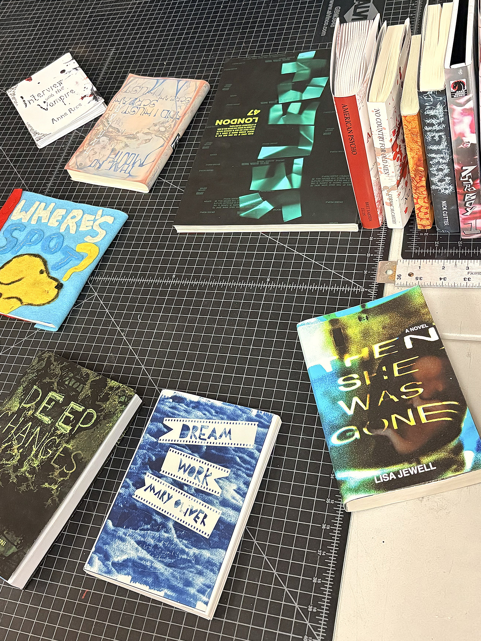
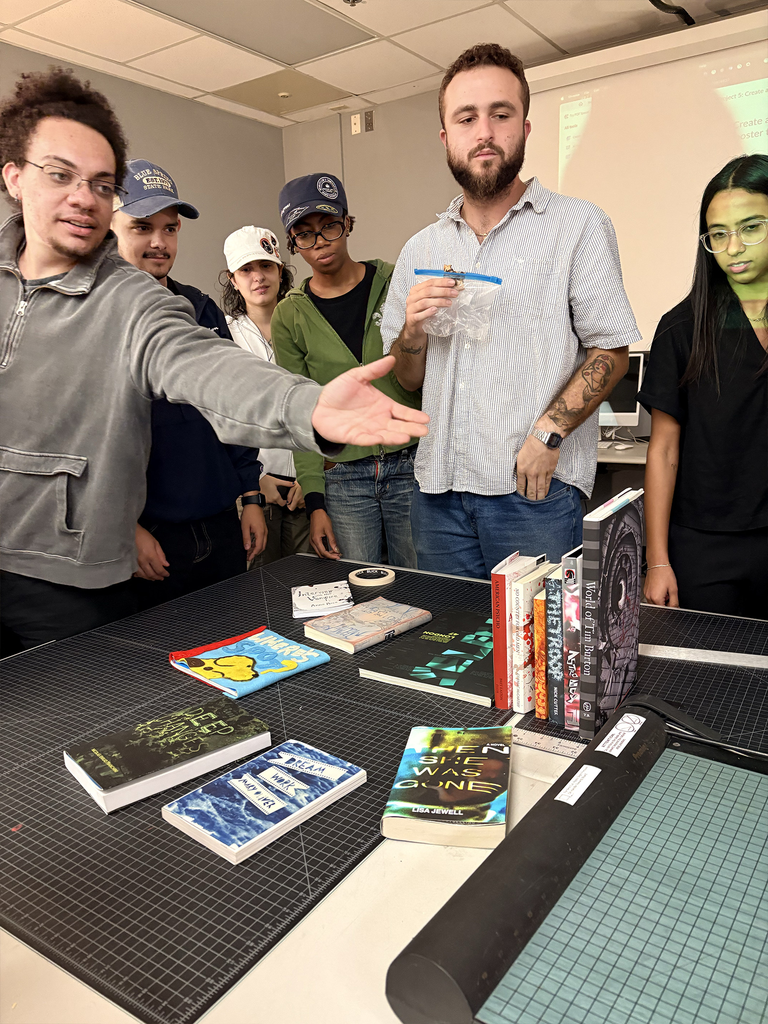
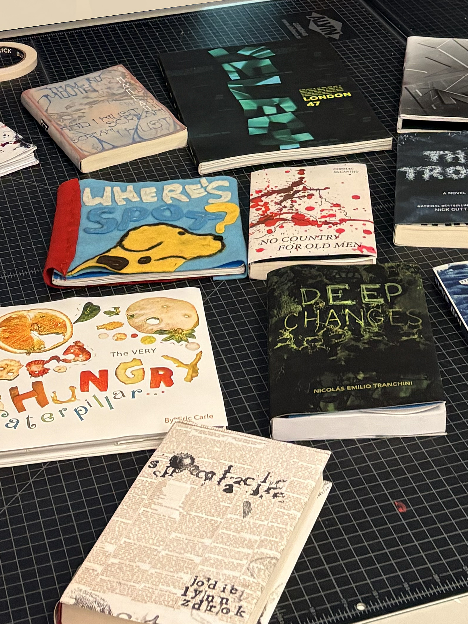
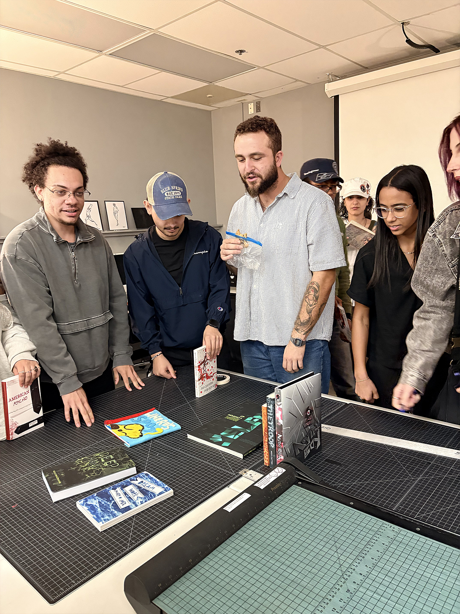
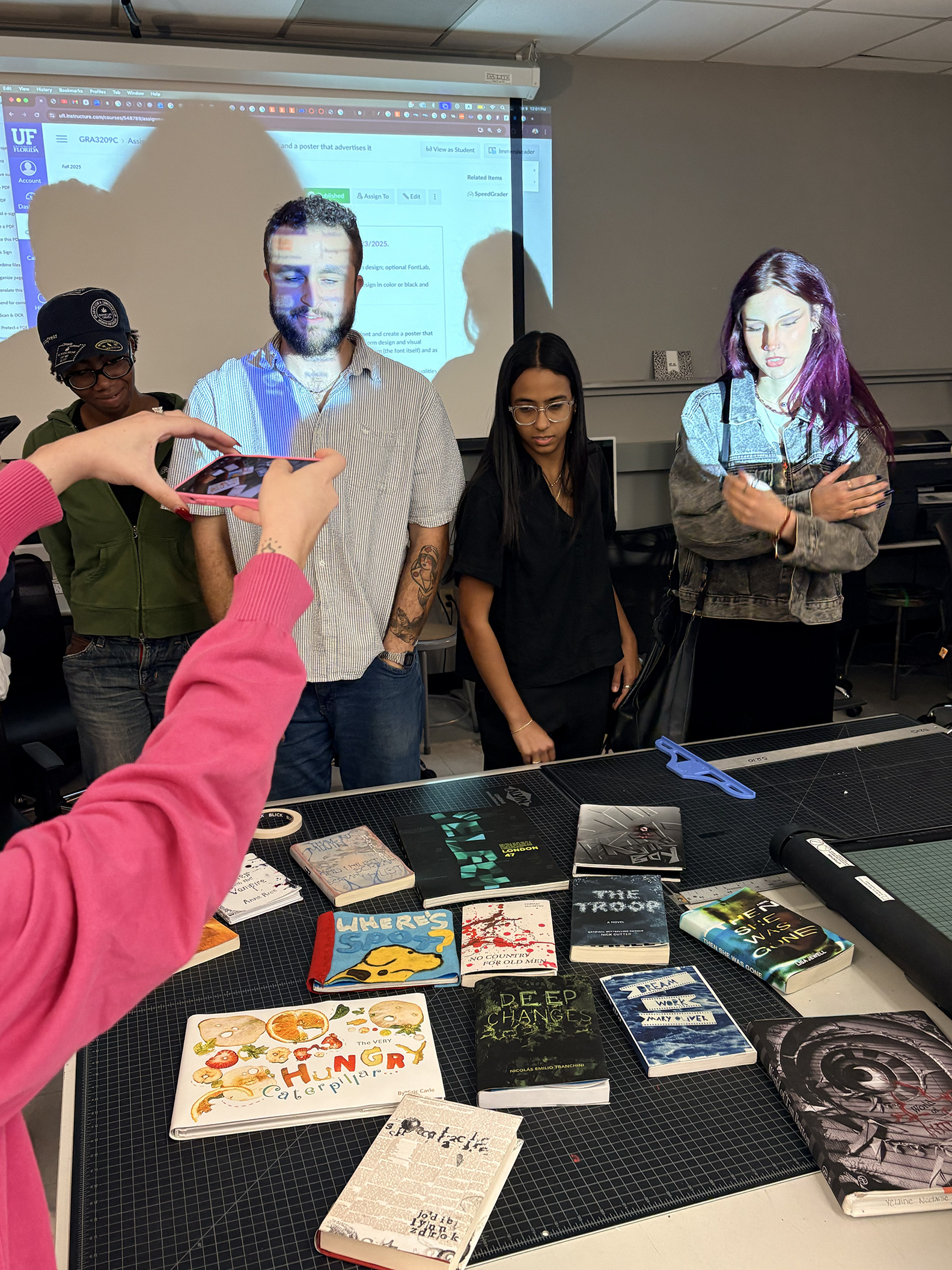
The final result became a curated library of the group’s favorite books, each reimagined through thoughtful and inventive cover designs. Together, they formed a collection of uniquely crafted pieces, rich in character and visual expression.